

The 10 defects we send back before an asset ships
Boxy forms, sticker eyes, gaps, bad grips, tiles that show their grid: the defects we look for first, and why they matter in your game.
By AssetLoom Team, published , Updated , 6 min read
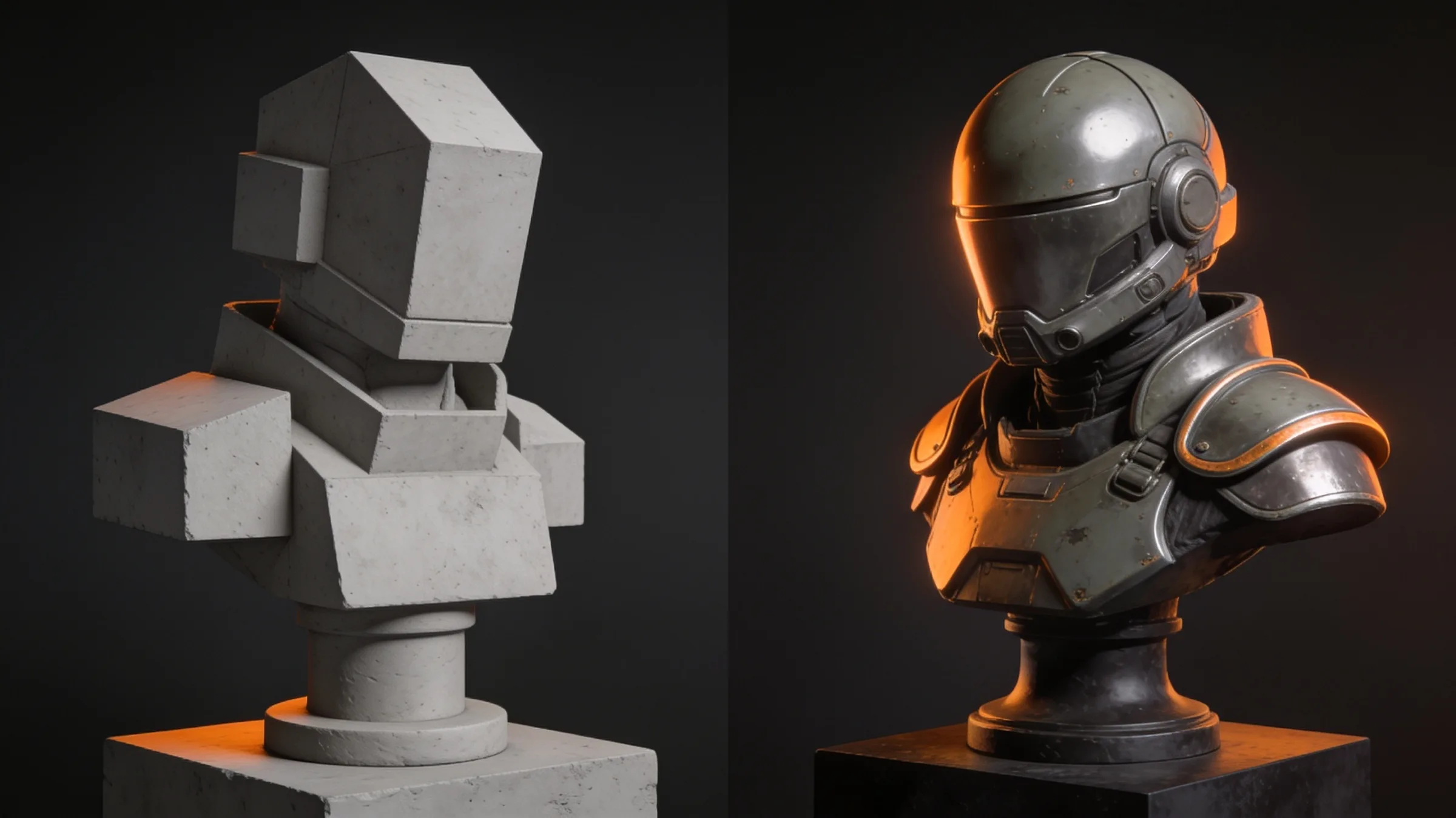
Every AssetLoom asset goes through a review before it ships, and that review is done by someone who did not build it. Most of what gets sent back is not exotic. The same handful of defects turns up again and again, across characters, props, vehicles and environment kits. Every asset is checked against the same list before it ships. Here are the ten we look for first, what each one looks like, and why it matters once the asset is in your game or render.
Why we keep a list at all
Automated checks catch a lot: triangle counts, missing textures, broken rigs, files that will not open. They do not catch an asset that is technically valid but looks wrong. A clear example: a driving animation can pass every automated check while the character holds the wheel with both thumbs pointing down. A person spots it in seconds. That is why every asset is looked at in renders and close-ups, not only checked by the numbers.
Each item below became a rule because it was sent back at least once. When a new defect turns up, it is added to the list.
The ten defects
1. Primitive, boxy forms
The most common send-back by far. A shape that is roughly right but built from boxes and cylinders reads as a toy: a breastplate as a flat slab, a robe as a board, a mask as a white plate, a gun grip as a brick. The first boots in our Sci-Fi Crew set had a flat plate sticking out under and behind them, which read like a ski. The fix is real construction: a sole slightly wider than the upper with a rounded heel and toe, armour plates that curve to the body and taper towards joints, cloth with folds and hems, grips with finger grooves and a palm swell.
Why it matters to you: silhouettes are what players read first. A boxy shape looks cheap at any texture resolution.
2. Sticker eyes
Eyes made as flat discs with a painted pupil look like stickers, and thin rings around them look like wire glasses. We want eyeballs set into the head, an iris with a gradient, lids or a brow that overlaps them, and some gloss so dark eyes do not read as holes. Non-human heads get the same care: horns and mandibles should curve and vary, not be straight cones.
Why it matters to you: faces are where the camera lingers, in cutscenes, close-ups and thumbnails.
3. Clothes that only work in one pose
A garment can look perfect in a T-pose and fall apart the moment the character crouches or sits: smears under the arms, a ballooning belly, a skirt tearing, trousers denting at the hips. Puffed-up clothing (shoulders like balloons, sleeves standing off the arm) is the same family of problem. We check every outfit in a set of extreme poses, including seated, and we do not rely on corrective shape keys, because most game engines will not drive them after export.
Why it matters to you: your game will put the character in poses we never rendered. The asset has to survive them.
4. Gaps at the seams
Where two parts meet (a helmet and a neck seal, a sleeve and a glove) there must be no visible gap in any pose. We look for dark slivers of the body underneath in a raised-arm pose and a guard pose, because a tiny gap at rest often opens wide when the arm lifts.
5. Hands that hold nothing
Hands get their own close-up review on every animation and character pack: the grip on a steering wheel, handlebars or weapon, which way the palm faces, where the thumb points, whether fingers clip into each other. A resting hand on a thigh should be relaxed and follow the surface, not splay out and sink into the leg. When a prop sits in a hand, the hand has to close around it. A handle floating beside open fingers is an instant send-back.
Why it matters to you: hands are in shot in almost every first- and third-person game, and bad grips are very hard to fix after export.
6. Wet-plastic materials
Uniform mirror gloss makes everything look like a toy or a wet sweet. We aim for satin finishes with variation and wear on the edges, so metal, leather, lacquer and bone each read as what they are. Colour variants have to keep focal features readable: if a character's eyes end up the same colour as its armour in one variant, that variant is not done.
7. Faces on top of faces
When two surfaces sit in exactly the same place (a panel over a wall, a screen behind a cover, a sign inside a face), the texture bake turns them into black patches and the engine flickers between them. An early build of our Grocery Store Simulator Kit had fridge doors that looked opaque grey because a solid panel sat behind the glass. We separate or shorten overlapping parts and check bakes for dark speckle before anything else.
8. Tiles that show their grid
A tileable ground texture repeats every cell. Any distinctive detail on it (a square patch repair, a scribbled crack, a gum spot) becomes a visible grid once a street is laid out. Ground tiles should be calm and low-contrast; distinctive details belong on separate variant tiles or decals you place on purpose, which is how the ground in our Modular Street Kit is made. We also check asphalt at low camera angles, where glossy wheel paths and seams can catch the sky as pale streaks.
Why it matters to you: you will lay hundreds of these tiles, and a grid pattern is visible from across the map.
9. Collision that does not match the shape
Game-ready props ship with simple collision shapes. If one convex shape is wrapped around a lamp post and its arm, or a swinging arm and its blade (the pendulum in our Dungeon Traps Kit), it fills in the space between them with an invisible wedge that players walk into. We split collision into pieces that follow the real parts, and we set the simplification per piece, so thin walls do not collapse and big shapes stay convex.
10. A listing that promises more than the renders show
This one is about trust rather than geometry. If a listing says a part is included, a preview should show it. If a tray is sold as holding tweezers and files, it has to fit real tweezers and files, not props scaled down to fit. If a kit promises a frame for every moving part, every moving part needs its frame. Scene dressing used only in the cover render is named as such. The copy is checked against the renders, line by line.
How the review works
Every asset is reviewed up close, in extreme poses, by someone who did not make it, and anything that falls short is fixed before release.
What this means for you
- When you buy an asset from us, it has been looked at up close, in more poses and angles than the store previews show, by someone who did not make it.
- If you spot one of these defects anyway, tell us. It goes on the list and the asset gets a fix release.
- If you make assets yourself, this list works as a checklist for your own work: check silhouettes, eyes, extreme poses, seams, hands, gloss, overlapping faces, tiling, collision and listing copy before you call something done.
Spotted a mistake or have a question? Email support@assetloom.io.
More from the blog
All posts
AI & industry
Unreal Engine 5.9 Preview puts AI agents in the editor: what game developers should know
Epic's Unreal Engine 5.9 MegaJam Preview adds editor AI agents, Unreal Canvas for generated meshes and AI animation. What shipped and what to check.
, 6 min read
Behind the build
How we make animation clips that chain, loop and keep hands on the body
One shared idle, Start/Loop/End clips and hands that stay on the skin: how we build humanoid clip packs with no pops at the seams, and what you can reuse.
, 7 min read

AI & industry
Half of October's new Steam games disclosed AI content: what Steam asks and how to be ready
49.9% of October 2026's new Steam games disclosed AI content. What Steam's AI disclosure asks, what Valve said, and how to keep a provenance record.
, 6 min read